# Add Material Design to an Angular application
Source: https://tpiros.dev/blog/add-material-design-to-an-angular-application
How to bolt Material Design onto an Angular application and use Material Components.
> To learn how to wire up Bootstrap instead, read [this article](https://fullstack-developer.academy/add-bootstrap-to-an-angular-application/).
# Installation
First, install the Material Design libraries via npm: `npm i @angular/material @angular/cdk`.
> For animations, install the dependency separately: `@angular/animations`.
If you're using the Angular Devkit, you can also run: `ng add @angular/material`.
### Animation
If we opted into animations, configure them in `app.module.ts`:
```typescript
@NgModule({
// ...
imports: [ BrowserAnimationsModule ],
// ...
})
```
If we don't want animations, we need to explicitly disable them:
```javascript
@NgModule({
// ...
imports: [ NoopAnimationsModule ],
// ...
})
```
# Configuration
With installation done, we can cherry-pick the component modules we want by importing them in `app.modules.ts`:
```javascript
@NgModule({
imports: [
MatSnackBarModule,
MatDialogModule,
// ...
]
// ...
})
```
## Import a theme
This step gets forgotten constantly. Material Design components won't display correctly without a pre-built theme. Several are available (and you can [build your own](https://material.angular.io/guide/theming)).
All pre-built themes live under `node_modules/@angular/material/prebuilt-themes/`:
- deeppurple-amber.css
- indigo-pink.css
- pink-bluegrey.css
- purple-green.css
To import a theme, open `styles.css` and drop in the following (swap the last value for whichever theme you prefer):
```typescript
@import "~@angular/material/prebuilt-themes/deeppurple-amber.css";
```
## Gesture support
Some components (`mat-slide-toggle`, `mat-slider`, `mat-tooltip`) rely on HammerJS for gesture support. Install it separately: `npm i hammerjs`.
Then import it in `src/main.ts`:
```typescript
```
## Icons
Material Design ships with a solid set of icons, but they need a separate step. The icons are available via a font family, loaded through `index.html`:
```html
```
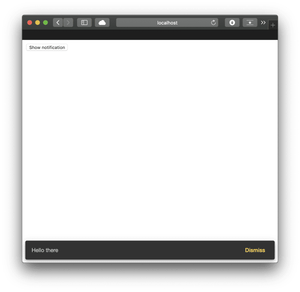
# Example
Everything's wired up. Let's bolt a Snackbar notification onto a component:
```html
```
```typescript
@Component({
selector: 'app-root',
templateUrl: './app.component.html',
styleUrls: ['./app.component.css'],
})
constructor(public snackBar: MatSnackBar) {}
open(message, action) {
this.snackBar.open(message, action);
}
}
```
## Dialogue (Modal)
In the [Bootstrap examples](https://fullstack-developer.academy/add-bootstrap-to-an-angular-application/), we built a modal. Here's the Angular Material equivalent.
> In Angular Material's terminology, a Modal is called a Dialog. Same thing, different label.
> We need the right dependency imported in `app.module.ts`. If you've been following along, that's already sorted.
First, the HTML in the component template:
```html
```
Then the TypeScript. We're creating a second component to represent the dialogue content:
```typescript
@Component({
selector: 'app-root',
templateUrl: './app.component.html',
styleUrls: ['./app.component.css'],
})
constructor(public dialog: MatDialog) {}
openDialog(): void {
const dialogRef = this.dialog.open(DialogOverviewExampleDialog, {
width: '250px',
data: {
message: 'Hello Material Dialog! :)',
},
});
dialogRef.afterClosed().subscribe((result) => {
console.log('The dialog was closed');
});
}
}
@Component({
selector: 'dialog-overview-example-dialog',
template: `
Dialog title
{{ data.message }}
`,
})
constructor(
public dialogRef: MatDialogRef,
@Inject(MAT_DIALOG_DATA) public data: string
) {}
onNoClick(): void {
this.dialogRef.close();
}
}
```
Since we've bolted on another component, we need to register it in the `entryComponents` array in `app.module.ts`:
```typescript
// ...
@NgModule({
declarations: [
AppComponent,
DialogOverviewExampleDialog
],
// ...
entryComponents: [ DialogOverviewExampleDialog ]
})
```
That's all we need for a functional dialogue using Material Design.
# Conclusion
Angular Material Design integrates tightly with Angular itself. It covers most use-cases for application development, and the setup is quick once you know where to wire things up.