Add Bootstrap to an Angular application
Back in the day when CSS was a lot less complex (think, the 1990s), it was relatively easy to style a page. However today there's a lot that developers need to take on to deliver a page with the correct design. Of course, to solve the need for seamless design, a few frameworks have emerged. In the first article in the series, we'll explore how to add Bootstrap to an Angular application, while in the second, follow-up article, we'll examine how to use Material Design.
Of course, there's no need to use both of these frameworks, either one is fine, but they have different integration paths.
Bootstrap
Bootstrap with its latest, fourth version, is one of the most utilised front-end component libraries. It allows developers to add a sophisticated grid system, use components such as dropdowns, modals, navigation bars and progress bars.
To use Bootstrap in an Angular project, first, make sure to create an Angular application via the Angular CLI by executing ng new [app-name].
Let's also go ahead and install Bootstrap for the project via npm: npm i bootstrap.
Note that Bootstrap depends on both Popper.js and jQuery - both of which you also need to install via
npm i jquery popper.js.
Also note that we could have inserted Bootstrap in
index.htmlvia a CDN but, in this article, we are reviewing how to add it to an Angular project in a more integral way.
Setup
Once the installation has completed, we need to modify the angular.json file which is located at the root of the project folder. This JSON file is where we can locate the settings for the application such as the TypeScript linter settings, test settings and others - including which external JavaScript and CSS file to load.
Find the path to styles and scripts (projects - project-name - architect - build) and add the following values:
"styles": [
  "src/styles.css",
  "node_modules/bootstrap/dist/css/bootstrap.min.css"
],
"scripts": [
  "node_modules/jquery/dist/jquery.min.js",
  "node_modules/popper.js/dist/umd/popper.min.js",
  "node_modules/bootstrap/dist/js/bootstrap.min.js"
]
The order of these items is important - since Bootstrap depends on jQuery and Popper.js, we need to include those before including the JavaScript for Bootstrap itself.
It's also very important to that if currently ng serve is running - i.e. we are looking at our application via a development server - we need to stop that process and start it again, as changes to angular.json do not get propagated into a running server so in order to see the changes a restart of the process is required.
Example
To do a quick test, let's open index.html and add the following HTML to it which should show a Bootstrap alert panel.
<div class="alert alert-success" role="alert">Bootstrap in action!</div>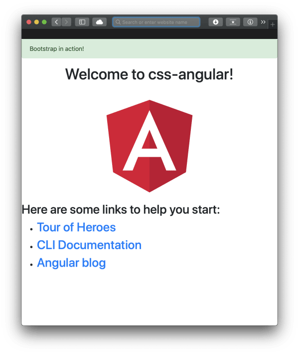
A dependency issue
So far this approach seems to be working fine; however, there is a dependency for jQuery which adds complexity to the project. It'd be much better if we could get rid of that dependency. Also, certain actions would throw some errors. Imagine that we wanted to call an action when a modal is closed, we'd have to implement this script in the template's component:
$('#myModal').on('hidden.bs.modal', (event) => {
  console.log('closed', event);
});
This throws the following error:
Cannot find name '$'. Do you need to install type definitions for jQuery? Try `npm i @types/jquery`
Let's do as the CLI suggests and install the type definition for jQuery. But even after the installation, we get the same error.
One solution - which is not preferred - is to declare $ with the any datatype in TypeScript: declare var $: any;
But even in this case, the event listener won't work because we need a document.ready() event as well, so we need to update the code to look like this:
$(document).on('hidden.bs.modal', '#exampleModal', (event) => {
  console.log('closed', event);
});
Only this time will this relatively straightforward piece of code work. Let's take a look at a much better solution and remove certain dependencies for the project at the same time as well.
ng-bootstrap and ngx-bootstrap
Both of these component libraries do pretty much the same: they give us Bootstrap components without jQuery and Popper.js as dependencies or without the actual bootsrap.js (A Bootstrap CSS is still going to be needed!).
Should there be concerns as to whether jQuer or Popper.js is used by these libraries, let's go ahead and uninstall them by executing
npm uninstall jquery popper.jsas well as removing the script entries fromangular.json.
ng-bootstrap
First, let's install ng-bootstrap by executing npm i @ng-bootstrap/ng-bootstrap. After the installation, we have two options: the first one is that we import the entire module for our Angular application, the other is that we selectively import only the components that we need:
import { NgbModule } from '@ng-bootstrap/ng-bootstrap';
// or:
// import { NgbAlertModule, NgbModalModule } from '@ng-bootstrap/ng-bootstrap';
@NgModule({
  ...
  imports: [ NgbModule ],
  // or:
  //   imports: [ NgbAlertModule,  NgbModalModule],
  ...
})
export class YourAppModule {
}
Selecting only the modules required by our application will reduce the overall size of the project.
Examples
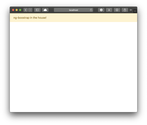
And that's it. No more work is required to integrate Bootstrap components. Let's give this a go - add the following in app.component.html (or any other component, but not index.html):
<ngb-alert [dismissible]="false"> ng-boostrap in the house! </ngb-alert>The above should display an alert panel.
And what if we would like to have a modal with an event listener? It couldn't be easier. Add the below code to a component:
<ng-template #content let-modal>
<div class="modal-header">
<h4 class="modal-title" id="modal-basic-title">Profile update</h4>
<button
type="button"
class="close"
aria-label="Close"
(click)="modal.dismiss('Cross click')"
>
<span aria-hidden="true">×</span>
</button>
</div>
<div class="modal-body">
<p>Hello modal, looking good!</p>
</div>
<div class="modal-footer">
<button
type="button"
class="btn btn-outline-dark"
(click)="modal.close('Save click')"
>
Save
</button>
</div>
</ng-template>
<button class="btn btn-lg btn-outline-primary" (click)="open(content)">
Launch demo modal
</button>
<hr />
<pre></pre>And add this to the component's definition:
`import { Component } from '@angular/core';
import { NgbModal, ModalDismissReasons } from '@ng-bootstrap/ng-bootstrap';

@Component({
  selector: 'app-root',
  templateUrl: './app.component.html',
  styleUrls: ['./app.component.css']
})
export class AppComponent {
  title = 'css-angular';
  closeResult: string;
  constructor(private modalService: NgbModal) { }

  open(content) {
    this.modalService.open(content, {ariaLabelledBy: 'modal-basic-title'}).result.then((result) => {
      this.closeResult = `Closed with: ${result}`;
    }, (reason) => {
      this.closeResult = `Dismissed ${this.getDismissReason(reason)}`;
    });
  }

  private getDismissReason(reason: any): string {
    if (reason === ModalDismissReasons.ESC) {
      return 'by pressing ESC';
    } else if (reason === ModalDismissReasons.BACKDROP_CLICK) {
      return 'by clicking on a backdrop';
    } else {
      return  `with: ${reason}`;
    }
  }
}
The above allows us to capture the close event for the modal as well as print the reason why it was closed - all this without a single jQuery / Bootstrap.js dependency.
Code sample taken from the ng-bootstrap documentation. It has been slightly modified.
ngx-bootstrap
Just like ng-bootstrap, ngx-bootstrap also gives us components in an Angular native way, without any dependencies on other JavaScript libraries.
To install it, please execute npm install ngx-bootstrap. As an alternative ngx-bootstrap also supports the ng add command: ng add ngx-bootstrap. This second approach also automatically edits the angular.json file to add the appropriate css files under styles so there's no need to add the location of Bootstrap's CSS manually.
Next, we need to add the import statements to app.module.ts:
// specific import
import { AlertModule } from 'ngx-bootstrap/alert';
// generic import to import further modules:
// import { AlertModule, ModalModule } from 'ngx-bootstrap';
@NgModule({
  // ...
  imports: [AlertModule.forRoot(), ...]
  // ...
})
Again, remember that importing only the required module is going to help to reduce the overall size of the application.
Examples
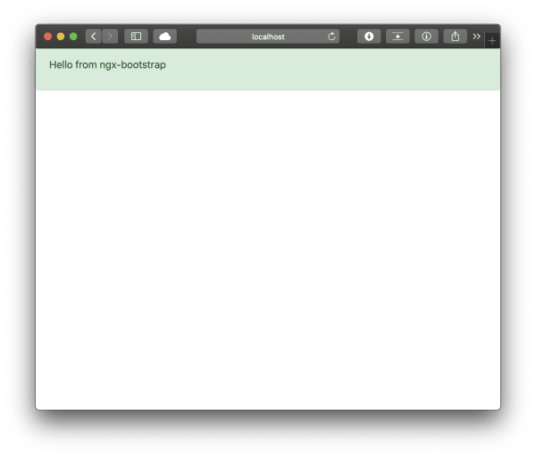
Let's test this again by adding an alert panel to a component template:
<alert type="success">
  <p>Hello from ngx-bootstrap</p>
</alert>
If we have done everything correctly, a green alert should be shown.
Just to be complete, let's also take a look at how to create a modal, with an event listener on the hide event:
<button type="button" class="btn btn-primary" (click)="openModal(template)">Create template modal</button>
<ng-template #template>
<div class="modal-header">
<h4 class="modal-title pull-left">Modal</h4>
<button type="button" class="close pull-right" aria-label="Close" (click)="modalRef.hide()">
<span aria-hidden="true">×</span>
</button>
</div>
<div class="modal-body">
This is a modal.
</div>
</ng-template>
import { Component, TemplateRef } from '@angular/core';
import { BsModalService } from 'ngx-bootstrap/modal';
import { BsModalRef } from 'ngx-bootstrap/modal/bs-modal-ref.service';
@Component({
selector: 'app-root',
templateUrl: './app.component.html',
styleUrls: ['./app.component.css']
})
export class AppComponent {
title = 'css-angular';
modalRef: BsModalRef;
constructor(private modalService: BsModalService) {}
openModal(template: TemplateRef<any>) {
this.modalRef = this.modalService.show(template);
this.modalService.onHide.subscribe((reason: string) => {
console.log(`onHide event has been fired`);
});
}
}And that's it, again we have managed to achieve this functionality without depending on an external JavaScript library.
Conclusion
In this article, we have reviewed how to integrate the popular CSS framework Bootstrap to an Angular application in three ways: natively, via ng-bootstrap and ngx-bootstrap.