Add Material Design to an Angular application
How to bolt Material Design onto an Angular application and use Material Components.
To learn how to wire up Bootstrap instead, read this article.
Installation
First, install the Material Design libraries via npm: npm i @angular/material @angular/cdk.
For animations, install the dependency separately:
@angular/animations.
If you’re using the Angular Devkit, you can also run: ng add @angular/material.
Animation
If we opted into animations, configure them in app.module.ts:
import {BrowserAnimationsModule} from '@angular/platform-browser/animations';

@NgModule({
  // ...
  imports: [ BrowserAnimationsModule ],
  // ...
})
If we don’t want animations, we need to explicitly disable them:
import {NoopAnimationsModule} from '@angular/platform-browser/animations';

@NgModule({
  // ...
  imports: [ NoopAnimationsModule ],
  // ...
})
Configuration
With installation done, we can cherry-pick the component modules we want by importing them in app.modules.ts:
import { MatSnackBarModule, MatDialogModule } from '@angular/material';
@NgModule({
  imports: [
    MatSnackBarModule,
    MatDialogModule,
    // ...
  ]
// ...
})
Import a theme
This step gets forgotten constantly. Material Design components won’t display correctly without a pre-built theme. Several are available (and you can build your own).
All pre-built themes live under node_modules/@angular/material/prebuilt-themes/:
- deeppurple-amber.css
- indigo-pink.css
- pink-bluegrey.css
- purple-green.css
To import a theme, open styles.css and drop in the following (swap the last value for whichever theme you prefer):
@import "~@angular/material/prebuilt-themes/deeppurple-amber.css";Gesture support
Some components (mat-slide-toggle, mat-slider, mat-tooltip) rely on HammerJS for gesture support. Install it separately: npm i hammerjs.
Then import it in src/main.ts:
import 'hammerjs';Icons
Material Design ships with a solid set of icons, but they need a separate step. The icons are available via a font family, loaded through index.html:
<link
  href="https://fonts.googleapis.com/icon?family=Material+Icons"
  rel="stylesheet"
/>
Example
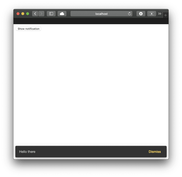
Everything’s wired up. Let’s bolt a Snackbar notification onto a component:
<button (click)="open('Hello there', 'Dismiss')">Show notification</button>import { Component } from '@angular/core';
import { MatSnackBar } from '@angular/material';
@Component({
selector: 'app-root',
templateUrl: './app.component.html',
styleUrls: ['./app.component.css'],
})
export class AppComponent {
constructor(public snackBar: MatSnackBar) {}
open(message, action) {
this.snackBar.open(message, action);
}
}
Dialogue (Modal)
In the Bootstrap examples, we built a modal. Here’s the Angular Material equivalent.
In Angular Material’s terminology, a Modal is called a Dialog. Same thing, different label.
We need the right dependency imported in
app.module.ts. If you’ve been following along, that’s already sorted.
First, the HTML in the component template:
<button (click)="openDialog()">Show dialog</button>Then the TypeScript. We’re creating a second component to represent the dialogue content:
import { Component, Inject } from '@angular/core';
import { MatDialog, MatDialogRef, MAT_DIALOG_DATA } from '@angular/material';

@Component({
  selector: 'app-root',
  templateUrl: './app.component.html',
  styleUrls: ['./app.component.css'],
})
export class AppComponent {
  constructor(public dialog: MatDialog) {}
  openDialog(): void {
    const dialogRef = this.dialog.open(DialogOverviewExampleDialog, {
      width: '250px',
      data: {
        message: 'Hello Material Dialog! :)',
      },
    });

    dialogRef.afterClosed().subscribe((result) => {
      console.log('The dialog was closed');
    });
  }
}

@Component({
  selector: 'dialog-overview-example-dialog',
  template: `
    <h1 mat-dialog-title>Dialog title</h1>
    <div mat-dialog-content>
      <p>{{ data.message }}</p>
    </div>
  `,
})
export class DialogOverviewExampleDialog {
  constructor(
    public dialogRef: MatDialogRef<DialogOverviewExampleDialog>,
    @Inject(MAT_DIALOG_DATA) public data: string
  ) {}

  onNoClick(): void {
    this.dialogRef.close();
  }
}
Since we’ve bolted on another component, we need to register it in the entryComponents array in app.module.ts:
import { AppComponent, DialogOverviewExampleDialog } from './app.component';
// ...
@NgModule({
  declarations: [
    AppComponent,
    DialogOverviewExampleDialog
  ],
  // ...
  entryComponents: [ DialogOverviewExampleDialog ]
})
That’s all we need for a functional dialogue using Material Design.
Conclusion
Angular Material Design integrates tightly with Angular itself. It covers most use-cases for application development, and the setup is quick once you know where to wire things up.