Add Material Design to an Angular application
In this article, we'll learn how to add Material Design to an Angular application as well as learn how to utilise Material Components.
To learn how to add Bootstrap, please read this article.
Installation
First, we need to make sure that the appropriate Material Design libraries are installed. Installation is possible via npm: npm i @angular/material @angular/cdk.
Optionally if we want to use animations we can install the appropriate dependency via npm too:
@angular/animations.
If using the Angular Devkit, we can also add Material Design via the ng add add command in the following way: ng add @angular/material.
Animation
If we opted in to use animations we need to configure it in app.module.ts:
import {BrowserAnimationsModule} from '@angular/platform-browser/animations';

@NgModule({
  // ...
  imports: [ BrowserAnimationsModule ],
  // ...
})
However, note that if we do not want to use Animations, we explicitly need to disable them as well:
import {NoopAnimationsModule} from '@angular/platform-browser/animations';

@NgModule({
  // ...
  imports: [ NoopAnimationsModule ],
  // ...
})
Configuration
Once we are done with the installation we can go ahead and select the component modules that we wish to use by importing them in app.modules.ts:
import { MatSnackBarModule, MatDialogModule } from '@angular/material';
@NgModule({
  imports: [
    MatSnackBarModule,
    MatDialogModule,
    // ...
  ]
// ...
})
Import a theme
This step is, and most developers forget to do this. For Material Design to display the right components with the appropriate design, we need to import a pre-built theme. There are multiple themes available (and of course you can build your own)
All the pre-built themes are found under node_modules/@angular/material/prebuilt-themes/:
- deeppurple-amber.css
- indigo-pink.css
- pink-bluegrey.css
- purple-green.css
To import a theme, open up styles.css and add the following entry (or change the last value to match the theme you'd like to use):
@import "~@angular/material/prebuilt-themes/deeppurple-amber.css";Gesture support
Some components, such as mat-slide-toggle, mat-slider and mat-tooltip use HammerJS for gesture support and therefore we need to install it separately by executing npm i hammerjs.
After the installation we need to import it in src/main.ts:
import 'hammerjs';Icons
Material Design comes with a nice set of icons as well - but again, if we want to use them, we need to make additional steps. The icons are available via a font family, so that's what we need to import via index.html:
<link
  href="https://fonts.googleapis.com/icon?family=Material+Icons"
  rel="stylesheet"
/>
Example
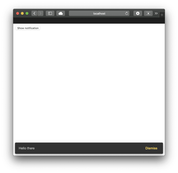
Now that everything is set up, we can go ahead and add a Snackbar notification to a component:
<button (click)="open('Hello there', 'Dismiss')">Show notification</button>import { Component } from '@angular/core';
import { MatSnackBar } from '@angular/material';
@Component({
selector: 'app-root',
templateUrl: './app.component.html',
styleUrls: ['./app.component.css'],
})
export class AppComponent {
constructor(public snackBar: MatSnackBar) {}
open(message, action) {
this.snackBar.open(message, action);
}
}
Dialogue (Modal)
In the Bootstrap examples, we have seen how to create a modal, so let's take a look at how to create a modal using Angular Material as well.
Note that in Angular Material's lingo, a Modal is called a Dialog, but effectively these are the same.
Also note that we need to import the right dependency in
app.module.ts- if you have followed this article, it has been pointed out earlier.
First, let's create the HTML in the component's template:
<button (click)="openDialog()">Show dialog</button>Then we can go ahead and write some TypeScript code - we are going to add another component - the component is going to be what the dialogue window displays.
import { Component, Inject } from '@angular/core';
import { MatDialog, MatDialogRef, MAT_DIALOG_DATA } from '@angular/material';

@Component({
  selector: 'app-root',
  templateUrl: './app.component.html',
  styleUrls: ['./app.component.css'],
})
export class AppComponent {
  constructor(public dialog: MatDialog) {}
  openDialog(): void {
    const dialogRef = this.dialog.open(DialogOverviewExampleDialog, {
      width: '250px',
      data: {
        message: 'Hello Material Dialog! :)',
      },
    });

    dialogRef.afterClosed().subscribe((result) => {
      console.log('The dialog was closed');
    });
  }
}

@Component({
  selector: 'dialog-overview-example-dialog',
  template: `
    <h1 mat-dialog-title>Dialog title</h1>
    <div mat-dialog-content>
      <p></p>
    </div>
  `,
})
export class DialogOverviewExampleDialog {
  constructor(
    public dialogRef: MatDialogRef<DialogOverviewExampleDialog>,
    @Inject(MAT_DIALOG_DATA) public data: string
  ) {}

  onNoClick(): void {
    this.dialogRef.close();
  }
}
Since we have added another component we need to utilise the entryComponents array in app.module.ts as well:
import { AppComponent, DialogOverviewExampleDialog } from './app.component';
// ...
@NgModule({
  declarations: [
    AppComponent,
    DialogOverviewExampleDialog
  ],
  // ...
  entryComponents: [ DialogOverviewExampleDialog ]
})
And that's all that we need to do to have a functional dialogue using Material Design.
Conclusion
Angular Material Design is a library that has tight integration with Angular itself, and it's straightforward to use. It has some robust functionality that should cover most use-cases for application development purposes.