The Importance of Media Accessibility (m16y)
Introduction
For most people, 4th January is not a remarkable day unless you were born on that day. For Beyonce however it was one of those days that she would never forget. Her company got sued for not providing enough web accessibility (aka "a11y") to visually impaired users. Sadly, this is nothing new. Not everyone knows about web accessibility, fewer people understand it, and unfortunately, not many people care. But as front end developers, we should care since we are the ones enabling accessibility on sites.
This article will highlight the importance of web accessibility, mostly focusing on modern, visual websites.
The Visual Web
It's undeniable that the web has turned visual over the past decade. Just think about the number of images, videos, and other visual elements that are available on a single webpage. Today, we have Instagram who spearheaded visual storytelling; e-commerce sites are now displaying 360-degree videos of their products along with high-definition images to increase the number of sales and to convince customers to buy a product. With a fun analogy, we can say that ten years ago, people used to say that they have a cat, then they started posting images of their cat, and today they are posting videos about the cat.
If you're interested in learning more about how the web has turned visual, check out the State of Visual Media Report by Cloudinary.
Challenges
Let's take a look at some of the challenges that developers could face today when it comes to accessibility and visuals on a site.
Users need support
According to WHO, roughly 1.3 billion people are living with some visual impairment, such as low vision, colour blindness, and (partial) blindness.
In other words, there are nearly 20% of the world population (which translates into about 2 out of 10 people) having visual difficulties. That also means that roughly 20% of your site visitors have trouble accessing web content.
This number continues to increase with time.
Laws surrounding accessibility
Understanding the importance of accessibility to these groups of users, many countries, especially in Europe and the U.S., have enforced its by-laws for any free content. Companies can't ignore these users and pretend as if they don't exist anymore since they have a legal obligation.
In the U.S. in particular, the number of lawsuits related to web accessibility has increased by almost 200% each year from 2015 to 2017 and hit the record of a tripling by 2018 😰.
E-commerce experienced this trend in the hardest way. A very well-known example is Target (a US based, general merchandise retailer). The company had to pay $10 million for not paying enough attention to their visually impaired users. Should they have invested a little bit into accessibility from the start, they could have very easily avoided paying this fine and making the life of their users very difficult.
Let's face it, this trend won't stop 📈.
Lawsuit? It only happens in the U.S., not where I live.
The U.S. may be notoriously known for being a litigious country for all the lawsuits; however, that doesn't mean that you should only care for accessibility because of the fear of being sued. That's not the right mindset.
To become an excellent, versatile front end developer/designer, it is part of your job to care for accessibility. It's your responsibility to make sure users can access the site that you're working on and have a good time using it, regardless of who they are.
Especially in e-commerce, any user with visual impairments must be able to browse the site without a problem and see the different colours for a given t-shirt, for example. Not only you're going to lose visitors, but there's a potential to lose profit as well because you're not serving your customer correctly.
Visual Impairments
Visual impairment (or vision impairment) is a functional limitation, a decreased ability to see to a degree in a way that it's not fixable by glasses. There are various estimations based on research as to how many people are visually impaired - in the United States, there are around 10 million people affected, while in the UK this number is estimated to be almost 2 million.
Let's take a look at some of the most common visual impairments, mainly focusing on the ones that are potentially effecting people browsing websites.
Light Sensitivity
Light sensitivity (or photophobia, which is not a fear of photos) is a pretty common issue, especially with people who work with computer screens a lot (such as developers 😉). Users with sensitivity to light usually find it hard, painful, and even impossible to read/concentrate when there is bright light or a combination of many bright colours together.
That's why 90% of developers switch to dark themes in their Dev tools, IDE, or even their OS (if it has one).
That's also why applications such as Twitter, Google, Facebook Messenger, and recently iOS as well provide "Dark Mode". And let's not forget about Kindle, which is famous for its E-ink technology to address this specific challenge.
Furthermore, there is no single standard for light sensitivity. It varies from person to person, depending on the surroundings, hence making it quite impossible to come up with one configuration set that suits everyone.
Contrast Sensitivity
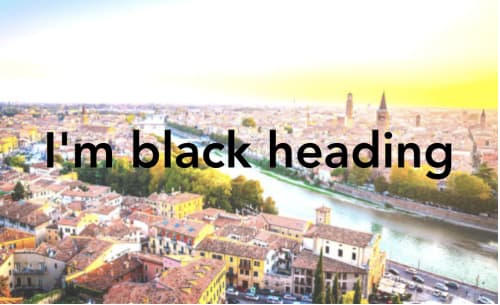
Contrast sensitivity is a challenge users face when reading the text over images or videos. It happens due to the lack of necessary contrast between text and background images/video. For example:
- White text on a light background
- Black text on a dark background
- Lack of text-shadow to differentiate.
Unlike light sensitivity, contrast sensitivity is easy to identify. Modern browsers such as Chrome and Firefox have introduced a contrast score check as part of their dev tools, helping developers to discover instantly if a section on a page is not visible enough.
Still, the awareness of this challenge is not always sufficiently taken. Sometimes the automatic score is not always 100% accurate.
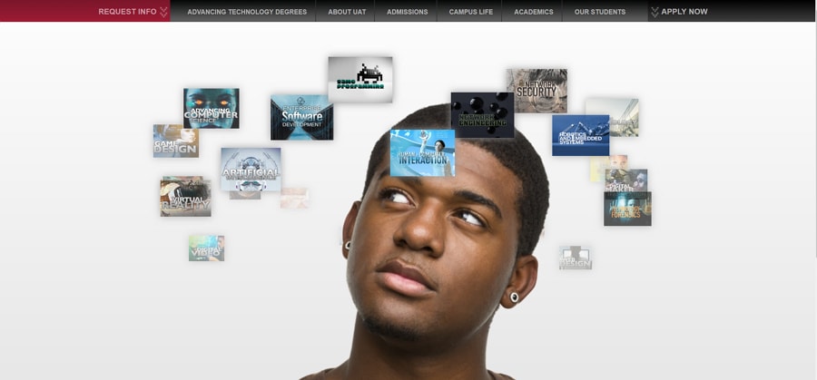
One of the random good “bad” examples is the website of the University of Advanced Technology. The text that appears on images is tough to read, if not impossible. Text such as this one poses essential information, and we should not try to guess what's written there but instead be able to read it simply.

Colour blindness
Colour blindness (or colour vision deficiency) is a condition that makes it difficult (or almost impossible) for people to identify or distinguish between specific colours. As stated by the NHS, "most people can adapt to colour vision deficiency". However, adapting is sometimes not enough.
Let's think about a potential situation when a person with colour vision deficiency visits our e-commerce platform, only to find that seemingly all of the t-shirts have the same colour. The colour picker has a dropdown with colours shown, without a label. How would this person know which t-shirt is red or green? How could a purchase be made? We need to appropriately prepare for such situations to provide adequate experience for the site visitor.
Solutions
Let's take a look at some solutions that can be applied.
Themes for light sensitivity
Offer "Dark Mode" or a "Light Theme" for your users and allow them to set the brightness, essentially letting them decide for themselves. There are several approaches to achieve this, depending on your technology stack and browser support. A straightforward way is to combine a CSS variable and the CSS invert method: filter: invert().
By defining invert(1), the browser inverts all colours available in your apps to the exact opposite matching colours.
/* Define css variable for dark/light mode */
:root {
  --nightMode: 0;
}

/* Apply the mode change to the whole app on <body> */
body {
  filter: invert(var(--nightMode));
}
However, as shown in the demo above, this filter effect also applies to all images within the app. By adding e_negate effect from Cloudinary transformation to the images, we can easily make sure their colours are reserved even in inverted mode (dark or light).
https://res.cloudinary.com/mayashavin/image/upload/e_negate/20-12-2D-pie.png
Easy peasy, right?
⚠️ Warning
Unfortunately,
filteris still not supported in IE. Hence if IE support is critical for your app, consider using other approach such as CSS-in-JS (styled components for Vue or for React).
Contrast
When dealing with text, another key aspect of making it more readable on pages is to do with contrast. The Web Content Accessibility Guideline (WCAG) defines that text or images of text must have a contrast ratio of at least 4.5:1 with the exception of large text (where it's 3:1), invisible and decorative text and logotypes, where the next is part of a brand name.
When discussing contrast, it's important to understand that we are not talking about changing the colour, but instead we want to make sure that people who have moderately low vision can still read the text found on the webpage by providing sufficient contrast between text and its background.
The larger text has, the lower the contrast criteria purely because larger strokes are used and therefore, larger text is by definition, easier to read.
Remember, contrast also applies to images of text - so anything that has been rendered into an image format but has text.
Generally speaking, 18 point text or a 14 point bold text is already considered to be "large text", and therefore it has the lower contrast ratio requirement.
If you'd like to make sure that the text and background colours of your website pass the contrast test, you can check out the Contrast Checker tool by WebAIM.
Translate colours to text
There may be situations when we can't change the image and add helpers for people with difficulties seeing colour (although with the transformation that we'll mention in Cloudinary in the next section it can all be automated). For such situations, we can apply a different technique, that is, to add the name of the colour as text to images using the alt attribute. So instead of saying that the image is a 't-shirt', we should explicitly state that it is a red t-shirt for example. Being as specific to the colour as possible at all times. Blue is very vague; however, navy blue is a lot better.
Since we have mentioned Cloudinary before it's relatively easy to grab the predominant colour of the photo automatically and add it as a tag. This would involve some code but roughly would look like this, using Node.js:
require('dotenv').config();
(async () => {
  const cloudinary = require('cloudinary').v2;
  // upload image
  const result = await cloudinary.uploader.upload('./blue.jpg', {
    public_id: 'blue',
    overwrite: true,
  });
  const public_id = result.public_id;
  // get predominant colours
  const colours = await cloudinary.api.resource(public_id, { colors: true });
  const main_colour = colours.predominant.google[0][0];
  // add predominant colour as tag
  await cloudinary.uploader.add_tag(main_colour, public_id);
})();
Once you have that piece of information you can very easily generate the final URL, maybe something along the lines of:
require('dotenv').config();
(async () => {
  const cloudinary = require('cloudinary').v2;
  const public_id = 'blue';
  const data = await cloudinary.api.resource(public_id);
  const url = cloudinary.url(public_id);
  const final = `<img src="${url}" alt="${data.tags[0]}" />`;
  console.log(final);
})();
Note that you can also enable automatic tagging meaning that AI-based services would attempt to detect what can be seen on the photo and add tags accordingly. You can read more about this feature here.
Pattern your colours
The bad news is that there is no straightforward coding solution available for this significant challenge on images. The conventional approach is to have designers or an image editing software - Photoshop or Gimp - involved in creating an extra resource for each colourblind case. That surely does not sound optimal for application performance and resource management in the long term.
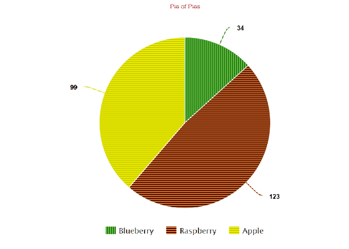
Well, the good news is that we can solve some of these problems that the user with colourblind would face by using a transformation from Cloudinary's. With the e_assist_colorblind effect, user now will be served with:

https://res.cloudinary.com/demo/image/upload/e_assist_colorblind/pie_chart.png
This effect adds stripes to highlight the difference between hot (red) and cold (green) colours.
Now users with deuteranopia can immediately differentiate the problematic colours on a T-shirt and decide to make a purchase (or not).
Tip:
You can control the intensity of the stripes by appending a numerical value to the parameter, for instance,
e_assist_colorblind:30to increase the intensity to30from a default10.More effect options can be found in the Cloudinary documentation.
Conclusion
Today, when a high percentage of the global population is online, it is vital that sites are accessible to all. The diversity of people visiting our website is ever so growing and we - both as owners of a site, or developers - must be prepared to serve the needs of many.
Neglecting accessibility features could not only lead to loss of customers, fewer engagements, a drop in user retention and ultimately, in some countries, a lawsuit.
Please don't forget to check out a project that we have launched recently about media accessibility which you can reach on https://m16y.io.


